nfoTools
N220201a: Not Your Desktop
| nfoTools | notes>N220201>N220201a | N220201a.html 0.0.6 2022-06-15 |
|---|---|---|
 |
Work-in-Progress |  |
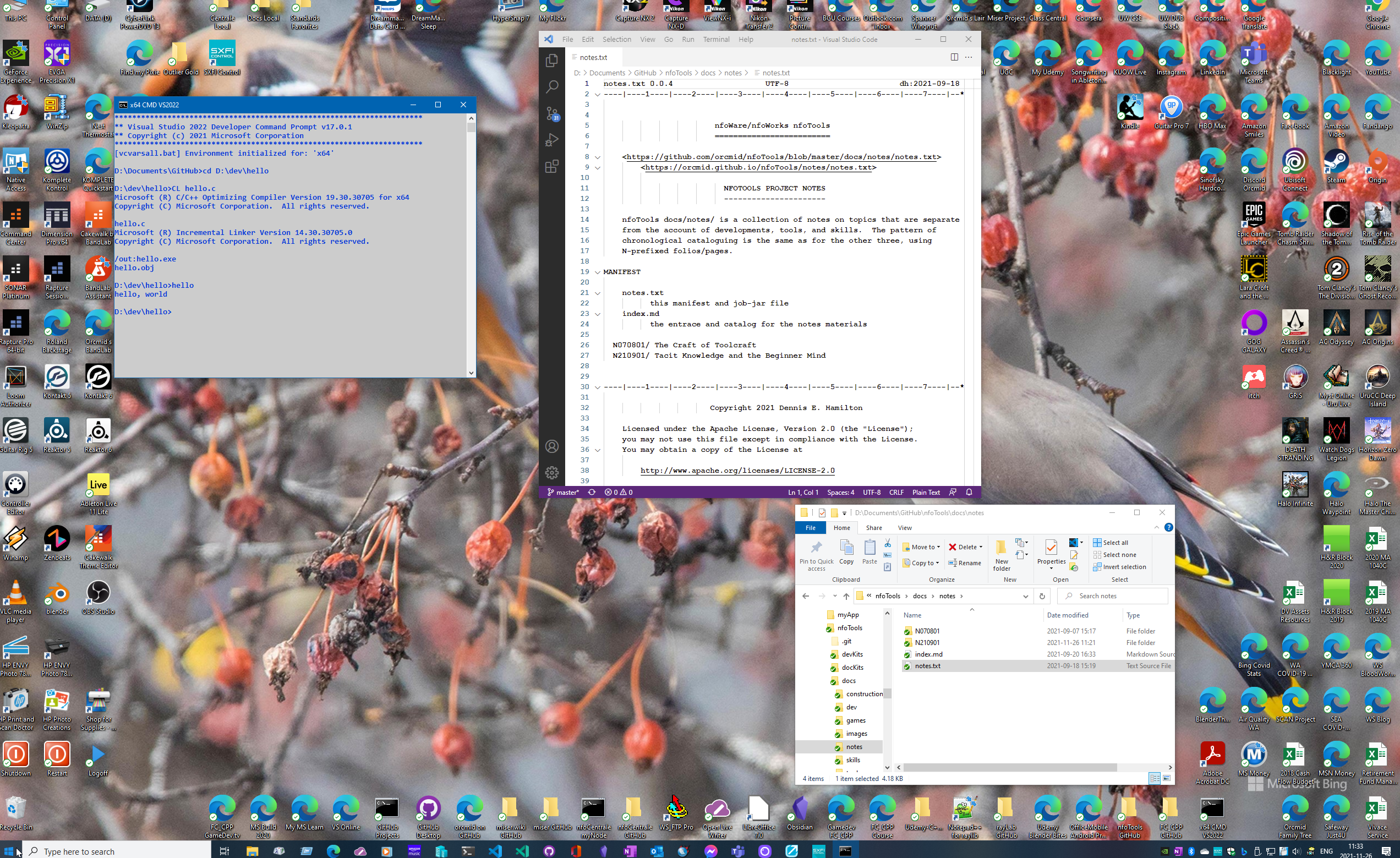
Perhaps one of the most distinctive tacit arrangements by experienced users of Windows PCs is the setup of their desktop display. I am no different. And my approach has been continued and refined for over 40 years. Even if I use only a fragment of my PC desktop in an illustrative screen capture, there is far too much that may be unfamiliar to my intended audience.
This Desktop is Not Yours

I would not ordinarily attempt to present my entire desktop display apart from making this particular illustration. Although the image file has all of the bits in full-size detail, the browser presentation is down-sized and degraded (although it might be expandable). That’s a common mistake made in providing screen captures: assuming that details are conveyed. If this image were used in a tutorial or a problem report, an observer may have no means to recognize an important detail that is obliterated in the rendering. I know not to do that. Sometimes I fail to check. And I certainly fail to realize I am presenting something that is alien to someone whose PC setup is quite different. It is probably best to rely on a default desktop, possibly on a guest account.

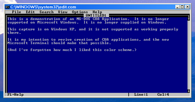
Without context, this image is more confusing than informative, despite, or maybe because of, the explanatory text. There are incidental aspects that may distract others yet are second-nature and invisible to me without careful beginner mind. It takes some care to prepare the reader for what is being presented, and ways to find out more must be at hand. In particular, what are CUA applications and why would anyone care now?
In making smaller, more-focused screen captures, there is increased risk of missing context without a provision for obtaining detail when the context is unfamiliar. Also, in making focused captures I can fail to connect the dots between how someone else could get to the equivalent place on their own computer, or at least understand why not. It is important to provide guardrails while not discouraging the impatient more-expert folk.
I seek a balanced approach that leaves noone behind, yet allows more-expert visitors enough short-cuts to satisfy their level of curiosity while revealing what might be new to them.
Providing Recognizable Desktop Operation
TBD
How Did We Get Here?
I’m attached to the size of my Windows PC desktop, providing 2560 x 1600 full-color pixels on a 30” monitor. This is the culmination of over 30 years of organizing desktop computer displays. It’s also great for PC games and streaming videos.
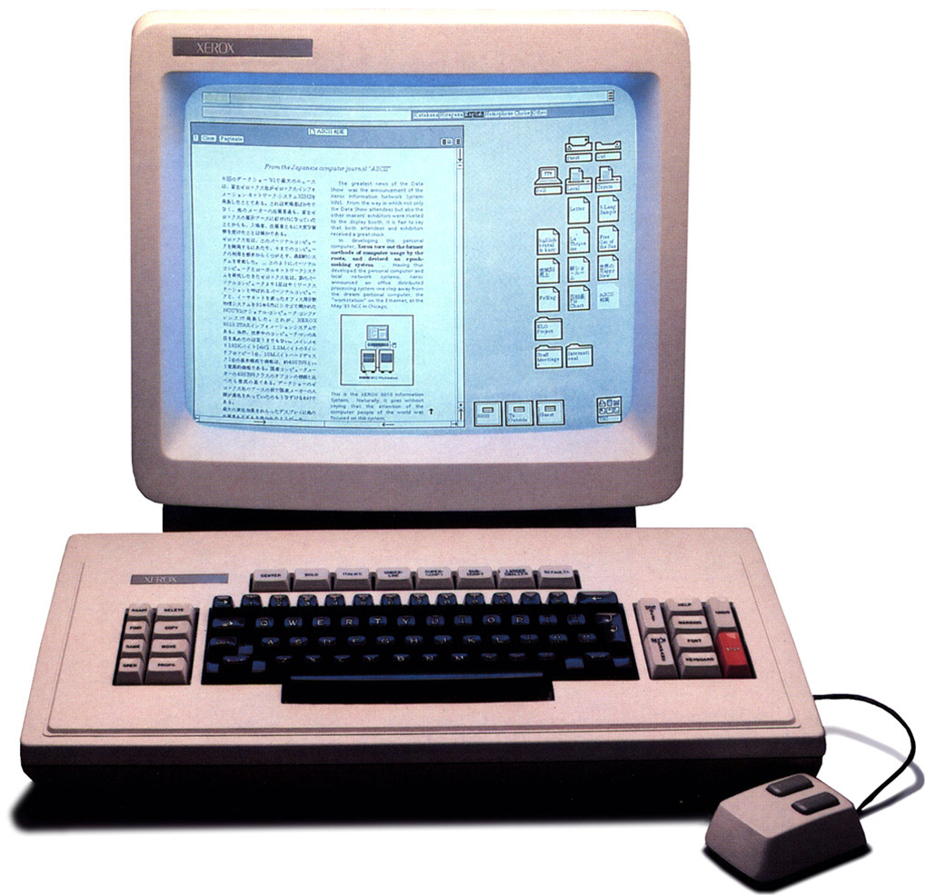
My first sustained experience of the desktop GUI model was at the start of my second tour at Xerox Corporation. Although I had seen the Xerox Alto in the late 70s, my return 10 years later exposed me to Xerox Desktop computers everywhere, starting with the Xerox 8010 Star.

These computers were everywhere inside the company (contradcting the Wikipedia account). Although engineers would treasure their Sun Microsystem workstations, and there was extensive use of multi-processor IBM mainframes, desk workers elsewhere in the business had these systems all on local area networks and connected to laser printers. Xerox Corporation was dog-fooding its view of the Office of the Future, including global connections via a proprietary network service stack.
The Xerox 8010 was rather sluggish, the ambitions of the software over-powering the capabilities of the processor (a proprietary Xerox chip set) and the hard drive.
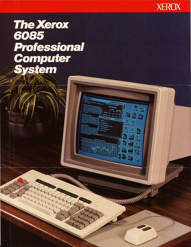
There was extensive effort to upgrade to the more powerful Xerox 6085 in the company.

I was very pleased to have that new desktop power. The arrangement of icons away from an area in which documents and other applications could have their windows stacked is apparent. Our displays were larger than the one portrayed and an around-the-fringes organization of icons became my habit.
While there were those who aspired to Xerox becoming Apple, these products failed against the IBM PC and the Wintel combination of Windows on Intel processors. The Xerox direct-sales business model and dependency on proprietary technology was helpless against that and the PC ecosystem.
The reliance on the Xerox-introduced desktop metaphor is evident in my Windows 10 Desktop. One ambition for the 30” monitor and Windows 10 is to be able to work with documents opened side-by-side for editing and other purposes. I am doing that as I edit this page.
Related Material
| ID | Started | Status | Topic |
|---|---|---|---|
| N220201 | 2022-02-25 | current | Beginner Mind Failures |
| N210901 | 2021-09-20 | current | Tacit Knowledge and the Beginner Mind |
Discussion about nfoTools is welcome at the Discussion section. Improvements and removal of defects in this particular documentation can be reported and addressed in the Issues section. There are also relevant projects from time to time.